

CREATIVE DIRECTION • ART DIRECTION • BRANDING • WEB DESIGN • GRAPHIC DESIGN
Dekanalog
Creating a distinct identity
Project Scope
• Visual Identity
• Branding
• Information Architecture
• Design System
Tools
Adobe Illustrator • Photoshop • Indesign • Figma • Squarespace • Pen & Paper
Deliverables
Logo • Motion Logo • Website • Poster • SVOD/ TVOD Assets • Marketing Assets • BluRay Assets
Overview
Dekanalog is a distribution company focused on bringing (inter)national films and soundtracks to the US market. As co-founder and creative director, I am responsible for the visual identity, branding and strategy on all customer touch points from website, marketing campaigns and social channels and artwork for all Dekanalog film, Blu-ray and album releases.
The core challenge was to build a brand from nothing, earning trust from the film industry and create a system flexible enough to serve a growing catalog of films that each carry their own aesthetic worlds.
Solution
Like the homemade DIY ‘zines that proliferated underground that gives voice to the underrepresented, Dekanalog gives space to international films and music that may go unrecognized in the US market. The visual identity needed to embody this ethos: confident yet unpretentious, bold yet unflashy, creative yet resourceful. Through a flexible brand system built around a distinct wordmark, 8-bit motion logo, and colors rooted in film history, Dekanalog has grown with 65+ film releases, streaming partnerships with the Criterion Collection, Mubi, Vinegar Syndrome’s OCN label, and press coverage in The New York Times, the Los Angeles Time, Variety, and Deadline.

Logo
The wordmark is set in Archivo Black, a grotesque sans serif typeface family designed for headlines. By reducing the tracking so that each letter blends into one another, Dekanalog is the sum of its creative partners, filmmakers and composers.
To further demonstrate this collaboration , the 8-bit motion logo showcases the individual pixels that combine to form the monolithic wordmark.
The icon design is the midpoint between the motion graphic and the wordmark: always growing. It’s used for social, physical media and small-format applications.
Color
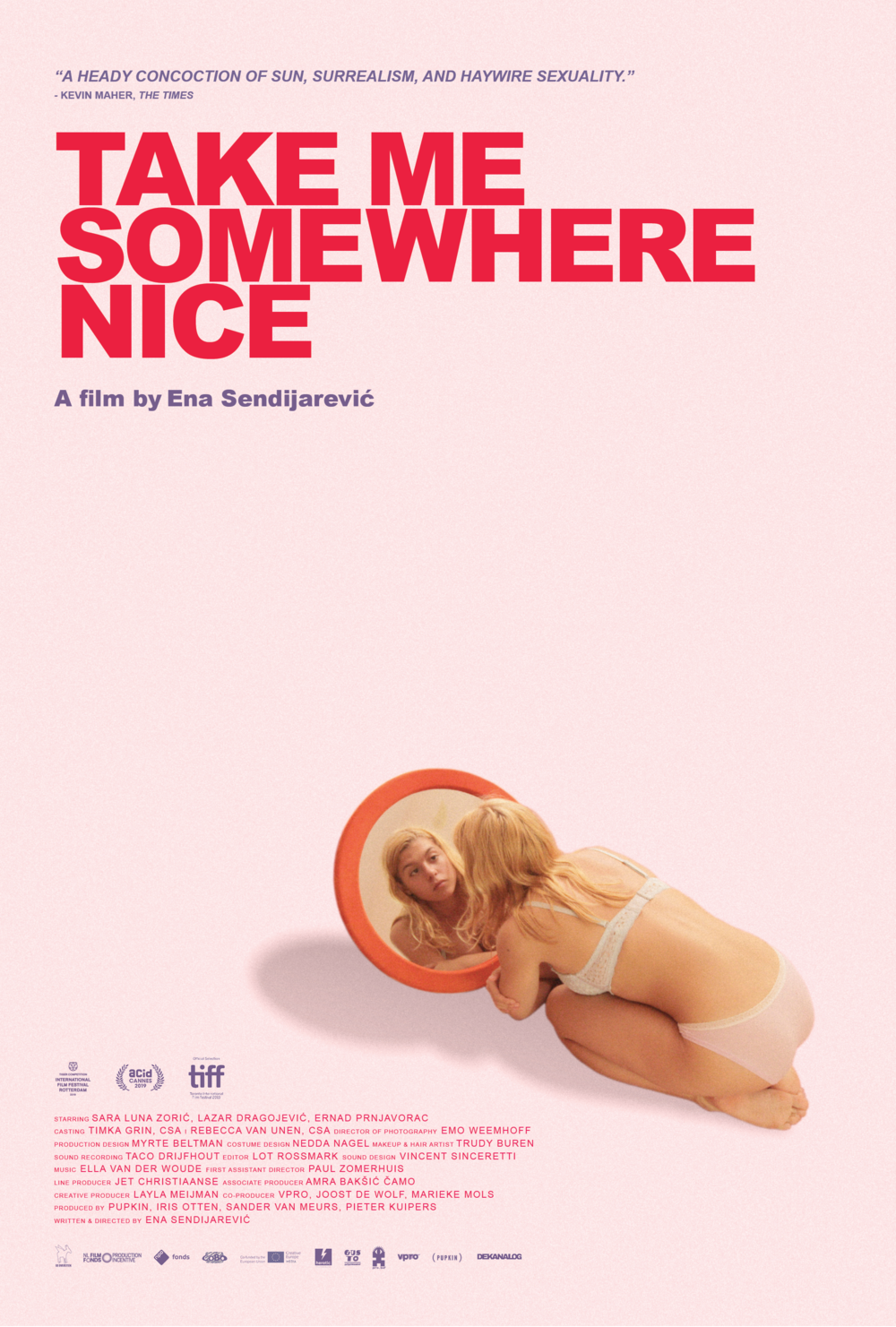
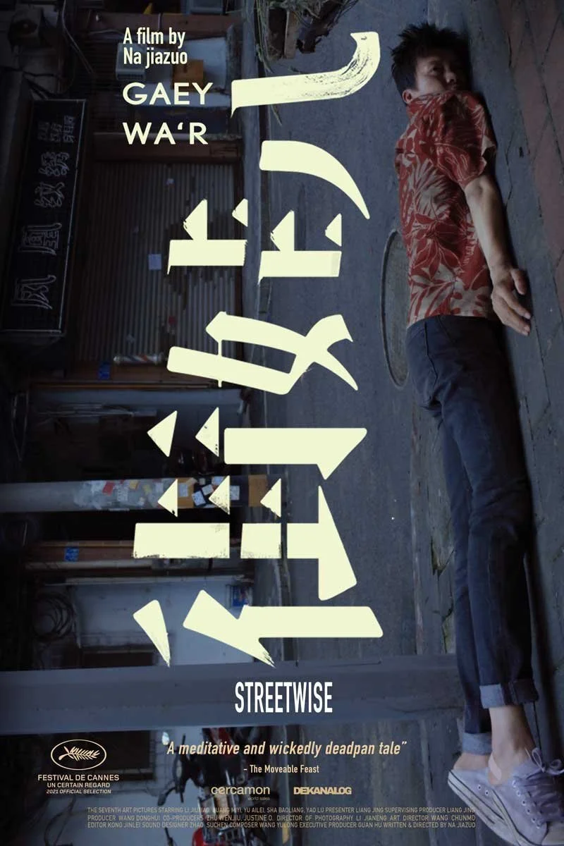
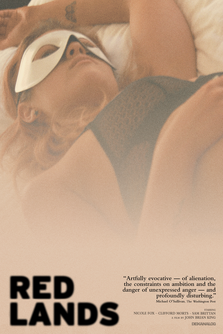
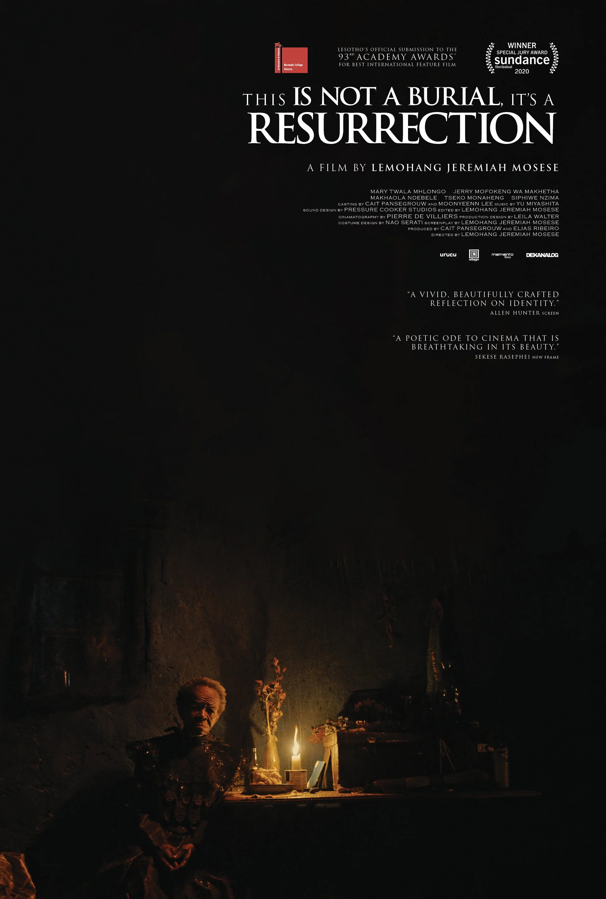
Dekanalog’s primary colors were chosen for what it references, not just how it looks. The white and yellow recall the standard subtitle colors in foreign films. Black and white reference the origin medium of film. These colors are rooted in the film history.
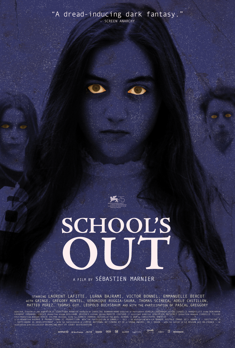
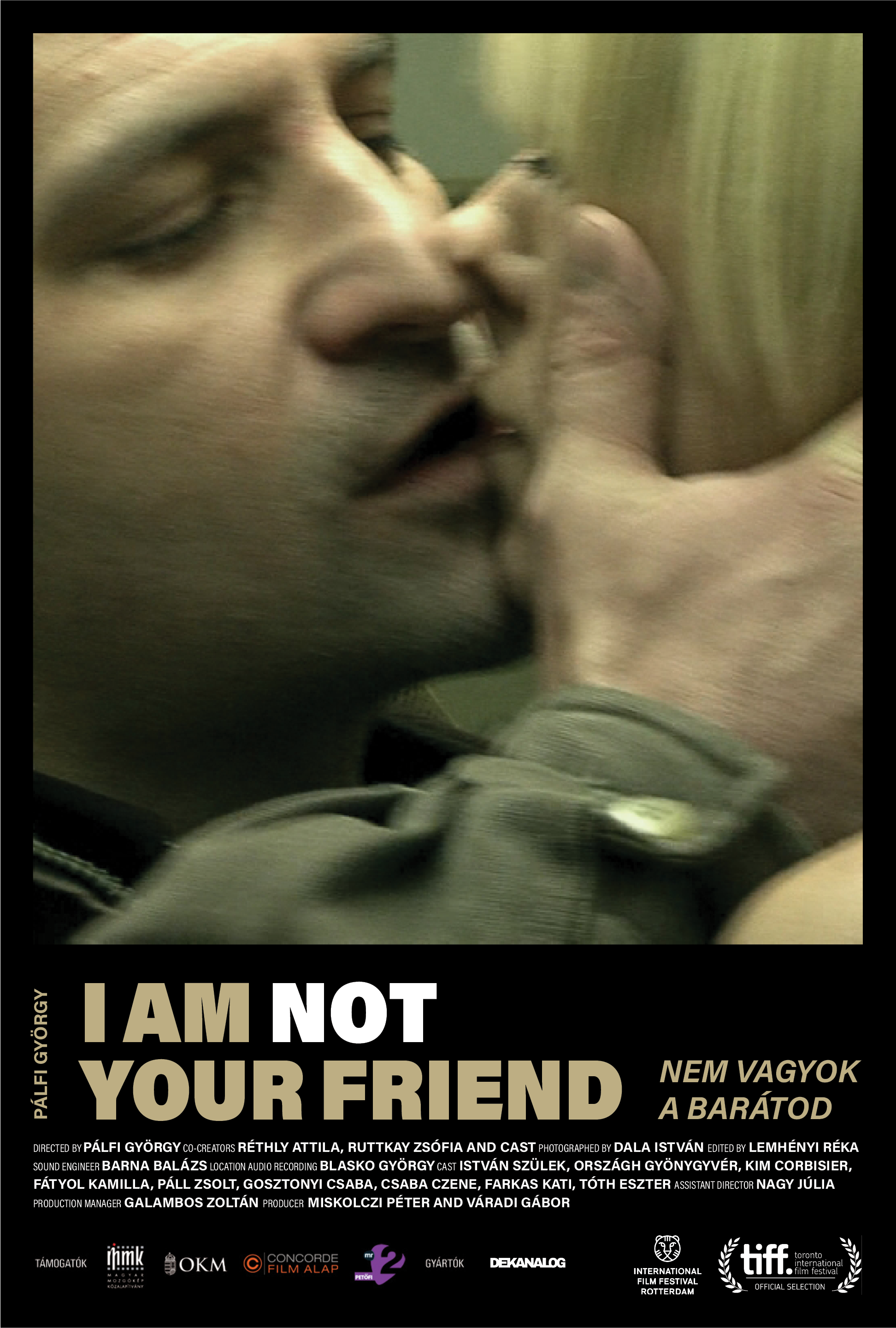
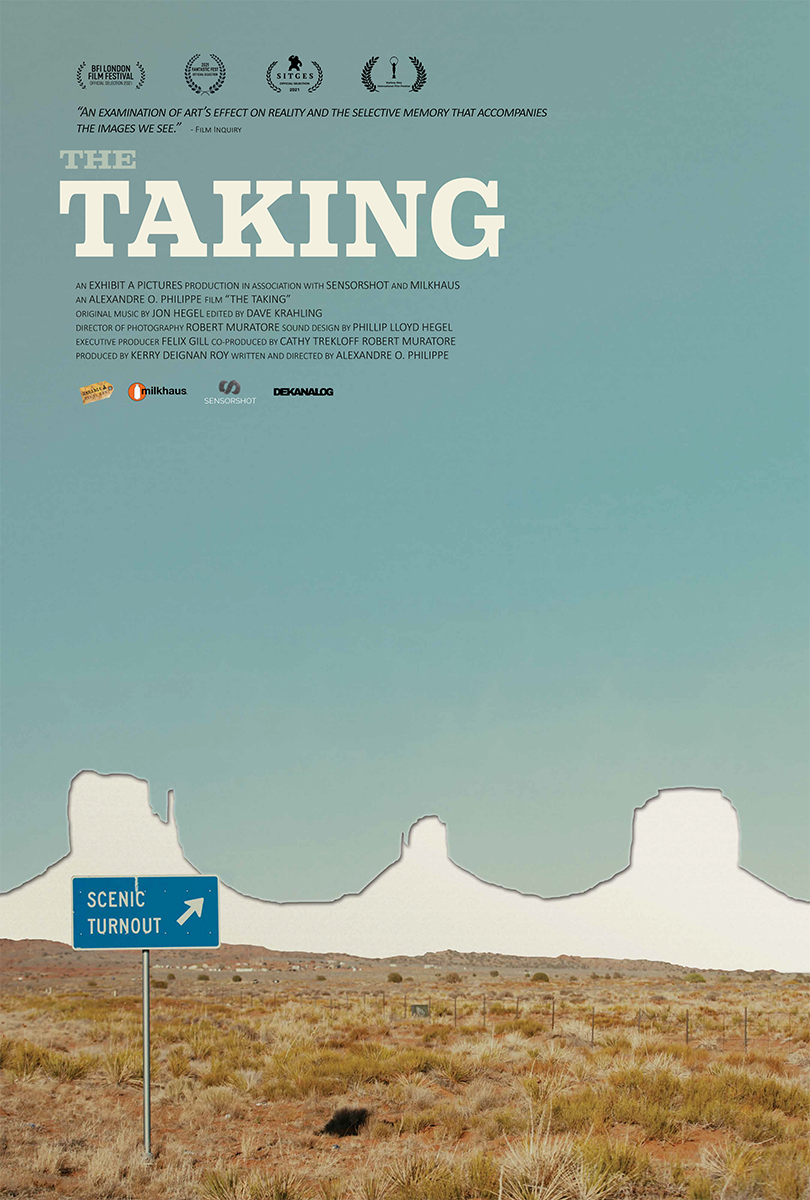
For Dekanalog branded content, the three primary colors are interchangeable, always optimizing for high contrast. For print and marketing assets (poster, Blu-ray artwork, SVOD materials), the palette flexes to the dominant color of the individual film, giving each release it’s own visual identity within the Dekanalog family.


Selected Poster Designs


A Design System Built To Scale
As the catalog grew, the website had to grow with it. Using Squarespace’s platform, an earlier iteration explored individualized color themes per film to mirror this approach digitally, but as the catalog scaled, maintaining these different color themes per title became unsustainable. The current site was redesigned to use a single background color across all film pages, a deliberate trade-off that prioritizes consistency and efficiency. Revisiting this and finding a scalable way to bring teach film’s identity into it’s own page is a future design goal.
The original navigation (Films, About, Contact) worked for a small library but as we expanded, that structure stopped serving users. The recent redesign reorganized films into five distinct categories: In Theaters, Streaming, Soundtracks, Blu-rays, and All Films. Film pages are built with consistent metadata so automation can be applied across categories and in the homepage to reduce manual updates as new releases roll in. A search function was also added to help users navigate a catalog that can no longer be browsed in a single scroll.
One acknowledged constraint is Squarespace’s lack of alphabetical sorting so the catalog is ordered by release date. For a library of this size, alphabetical would be a better experience. It's an identified gap and a planned improvement.
The original homepage (2020-2026)
The update (2026)
Reflection
Building a brand for your own company means no formal brief and approval process. Decisions moved as long as partners were on board, and they trusted the direction. The work that has held up best is rooted in reference: the film history in the color palette, the typographic logic of the wordmark, the pixel metaphor in the motion graphic. The website's simplified color system was the right operational call, but bringing each film's visual world into its own page, sustainably, is the next problem worth solving. The brand identity has received unsolicited positive callouts from customers and press, recognizing Dekanalog's visual distinctiveness within the independent distribution space.
“Dekanalog is a rather new player, working since 2020, but in a few years has amassed a compact but impressive library of films… You can buy their beautifully designed discs at the Vinegar Syndrome web store.”
— Popflick